According to surveys carried out on product packaging and labeling:
- 59% of consumers say they always read product labels before buying products for the first time
- 60% of consumers are less likely to buy a product whose label contains insufficient information
- 90% of consumers are more likely to buy a product if it has a peel-off instant savings coupon
- 56% of consumers say recognizable logos draw their attention to products
These statistics reveal the importance of using product labels that are not only visually appealing but are optimized to provide the information consumers seek.
Marketers, brands, and manufacturers continuously strive to understand consumer behaviour to find out what matters to their potential customers and what doesn’t.
Labels Matter
A great product label can draw the attention of shoppers and contribute to building your brand identity.
Your product may be good, but in a competitive market, that’s not enough to sell it. You have to go the extra mile. While an effective marketing strategy is a must, you shouldn’t forget that a product label can make or break the sale.
In this post, I’ll take you through six steps you need to follow to create attention-grabbing labels that sell products.
So, how do you go about it?
1. Be Original
The label you create must be original, memorable, and unique. Take time to research your competitors’ labels, then create one that’s better and more captivating. A copied label can lead to legal tussles, and a boring one will never draw the attention of shoppers.
It’s important to make sure your brand identity is well-defined as it influences the decisions you make about your label’s design. For example, some products have very wordy labels – like Dr. Bronner’s Liquid Soaps. However, the company can easily get away with this because the products showcase its unique personality.
Don’t put anything on the label that’s unrelated to the product just to make it look better. Also, avoid anything that may mislead first-time customers.
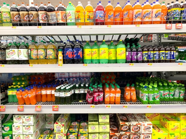
Using the right fonts and colors can determine the success or failure of a product. The label fonts you choose must complement the fonts of your brand. If you have brand colors, use them in the label. If you don’t, use complementary colors that don’t clash. Focus on one or two colors to ensure your label makes a bold statement when sitting on a shelf. Avoid a rainbow of colors that will be visually confusing to consumers.
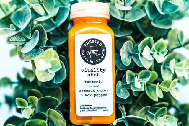
If you’re selling a food or drink product, pick a color that’s related to the product – red for strawberry, brown for chocolate, and so on.
2. Make the Text Readable
Product labels usually display vital information such as the logo, the name of the product, and the units (or the quantity). Some products only have a tagline or a short description. Additional information – like the ingredients and instructions on how to use the product – is usually on the back of the product.
One of the most important things to remember when creating a label is to make sure the text is legible. Select the correct font size so people can read the label from a short distance away. Most regulators set a minimum text size of 2.5mm (7 points). If space permits, the text size should be increased proportionally to the label and the container size to enhance readability.
Steer clear of stylized fonts as most people find them difficult to read. Make sure the font you choose clearly distinguishes similar letters and numbers like “i,” “I,” and “1”.
3. Consider the Size and Shape of the Container
The container’s size and shape determines how much content you can fit in. There are four popular product label shapes:
- Circular Labels: these are mostly used on products with circular packaging. When paired with the right colors, they are visually attractive and quickly grab attention.
- Oval Labels: oval labels are ideal for products with limited design space. They make products look modern and elegant. The labels are commonly used by food, beverage, and beauty companies.
- Rectangular Labels: these traditional product labels either have pointed or rounded edges. They are mostly used for food products.
- Square Labels: square product labels do not consume a lot of space and leave room for other design elements such as images and graphics.
When choosing the shape of a product label, think about the product. A label that doesn’t take up a lot of space is ideal for an aesthetically-pleasing product. But if your product is not visually appealing, get a larger label.
Measure the container to find out its exact size. If you fail to do this, you may end up with a label that doesn’t fit – and that will make your product stand out for all the wrong reasons.
4. Avoid Grammatical Errors
70% of consumers’ buying decisions are made in-store. The last thing you want is a shopper choosing your competitor’s product over yours simply because of a poorly-written product label.
Make sure you write the product name and the description correctly. Most people think this is obvious, yet there are many companies that fail to do it. Misspelling any word is seen as an error in diligence and is something many shoppers don’t excuse.
Product label misspellings and typos may seem like small gaffes, but they make your product seem untrustworthy and your company seem careless. Even a tiny misspelling or typo can cause a lot of confusion. If you’re working with a label designer, let them know that the content is of top priority.
Translation is one of the top challenges many international businesses face during the label production process. Don’t automate the process because automatically translated text usually sounds unnatural and can’t be understood by native speakers. Hire a professional translator for the task to ensure the information is translated naturally. You should also emphasize information through design elements to make messaging clear.
A grammar checker like ProWritingAid can come in handy during the spell-check process. ProWritingAid checks for grammar, punctuation, and spelling mistakes to help improve your writing. You can also check how readable your descriptions are. Did you know that most adults prefer to read at a seventh grade level? This is important as people will need to read your labels quickly. Easy understanding is key.
If you happen to notice a spelling mistake after the label has gone to print, you have no option but to get rid of the original and redo everything.
5. Test and Proofread
After writing your label, get as many people as possible to look at it – from stodgy academics to hip teenagers. You will get a whole range of opinions and perspectives. And the best thing is that nothing will escape anyone’s notice.
Many companies hire copywriters to write marketing materials like press releases, ads, and white papers. But they often forget to hire proofreaders to go through the text on the products. This is a very costly mistake that can hurt a brand.
You’ve spent years building your company’s image. The last thing you want is to ruin that image with a product label typo. And even if you notice the mistake before releasing the product to the market, it will still be a costly one because you’ll have to pay to have all the labels reprinted.
Don’t make the mistake other businesspeople have made – being narrow-minded. When you work with the same people from start to finish, you all start to look at the project the same way. You need people outside your circle to tell you the truth about how the label will look to the public.
Remember, the label is what will introduce your product to potential customers. It should be eye-catching and persuasive to stand out.
6. Use High-Quality Images
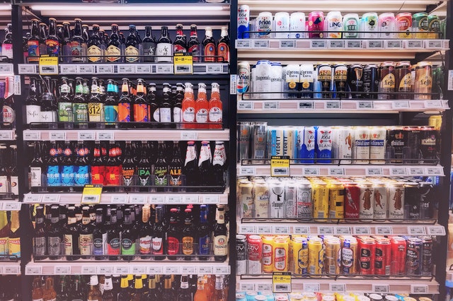
Image quality is important when you’re designing a label. An image can make a label go from outstanding to mediocre real fast. You may have a great logo, a persuasive tagline, and a striking color scheme. But if the image is low quality, the product will get downgraded by the shopper in seconds.
So, which images should you use?
For starters, don’t use any images you’ve sourced from the internet. Also, avoid using JPEGs, PNGs, and low-resolution images. JPEG images don’t print well. Use vector images if possible and go for at least 300DPI (dots per image).
Create Labels that Make Your Products Fly Off the Shelves
Product labels shouldn’t just be pretty. They should stand out on the shelf, showcase your brand values, and draw the attention of shoppers.
Label writing is one of the seemingly simple aspects of label design and is frequently taken for granted. Most businesspeople think that because they write well, they can write their product labels.
Knowing how to write is not enough. Simple errors in your product labels can have a negative impact on your business reputation and lead to decreased revenue.
Make use of the tips I’ve shared in this article to avoid common label design mistakes. You’ll create labels that attract consumers and motivate them to buy.
Already got some text for your label? Run it through ProWritingAid’s editor!

Be confident about grammar
Check every email, essay, or story for grammar mistakes. Fix them before you press send.
