Your book cover is the first thing readers see. Despite the old saying, readers will use it to judge whether to learn more or decide that your book isn’t for them. So, how do you make sure you fall into the first category? You make the cover enticing.
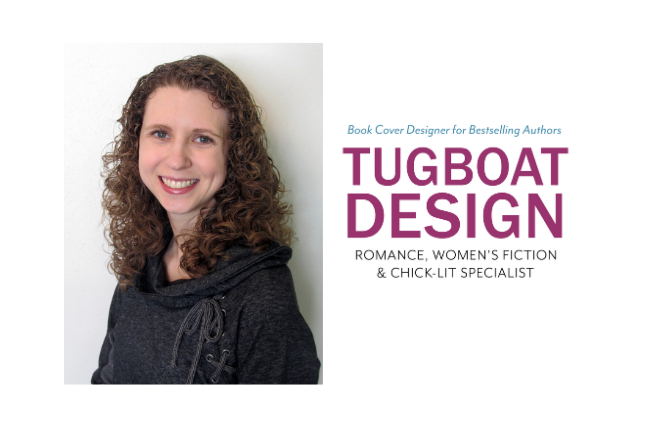
I interviewed Deborah Bradseth, an experienced book cover designer and owner of Tugboat Design, to get the scoop on creating an enticing book cover.
Getting Started
MC: From my perspective as a reader, an enticing book cover is one that makes me want to read the book. It’s eye-catching and tells me right away what genre the book is. From a designer’s point of view, what makes a book cover enticing?
DB: Emotion. If you can create an emotional reaction to a cover, you will draw in more readers. Whether that’s love, fear, hatred, happiness, sadness, curiosity, or any range of feelings or reactions. You can do this just by the color scheme chosen. For example, if you want the reader to feel happy, use bright yellow or a light blue with a script font and a lot of white space. If you want the reader to feel suspense, use red and black, or blue and black with a bold font and a darker color scheme.
Genre plays a big role in this process, and the tone of the story helps dictate what emotion to convey. Another big factor into making a book cover enticing is to avoid overcrowding the cover with unnecessary elements. The more streamlined you can make a cover, the more eye-catching it becomes.
If you’re producing a non-fiction book, you want to appeal to the mind, not the heart (unless it’s a memoir). You want a straight-forward image, so readers know exactly what the book is about. Keep it simple, yet try to be creative with the image while still getting the main topic across. Easy, right?
MC: What are the three biggest mistakes you’ve seen people make with cover design?
DB: Great question, and although I could list way more than three, here’s what I would classify as the top three mistakes:
Mistake #1: Trying to match all the details perfectly and/or trying to be different or revolutionary.
Let’s say you have a dog on your cover. It’s good to match the breed, but you don’t have to match the exact markings. If you can come close, that will suffice for the cover. Readers won’t be comparing the cover to the description in the book. Now, if your cover has a female lead with brown hair, but you have a girl with blond hair on the cover, readers will comment on that. Therefore, I would try to match those types of details when possible. But, if that composition is way more powerful than a different model, it might be worth the discrepancy if it will sell your book. Most designers can alter hair color though, either by doing a color change or hair swap.
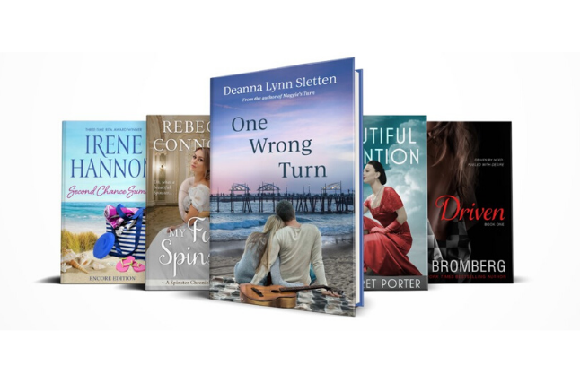
Don’t try to be too different with your cover design. If your goal is to sell your book, you need to have a cover that looks like the other bestselling covers in your genre. Just like all other products out there, book covers need to follow design and genre conventions and tropes so readers know what type of book yours is. You ultimately want your cover to have a similar feel to a bestselling book. That way, when someone sees your book, it reminds them of the one they just read and they’ll be more likely to click on your book. If your book looks nothing like what they’ve read and doesn’t look like the genre, they will pass by it. You only have 3 seconds to grab their attention, don’t waste it!
Mistake #2: Poorly chosen fonts and placement.
A font can make or break your design along with its placement. If you have a basic image but excellent typography, that will always be more powerful than an epic image with horrible font and placement which will still look amateurish. Sometimes authors think they need their font to “stand out” so they add crazy effects, colors, or drop shadows to make the title “pop”. However, you don’t want your title and author name to look superimposed over the image or like an after-thought. You want it to look natural, like it belonged there all along.
One way to achieve this is by using natural contrast. Your title font should communicate your genre, while the author name and other text should be a more standard serif or sans-serif font that complements the title. It’s best to have at most 2–3 different fonts in your design. The size of your author name will depend on your genre, so you’ll want to look at the bestsellers and see if the author name is large, medium, or small. The myth floating around is “I don’t want my name large because I’m not important yet”. Hint: Readers don’t know you’re not famous yet, so do what works best for your genre and cover design.
Mistake #3: Forgetting to establish a hierarchy within a design.
If everything on the book cover is the same size – the image, the title, the author name – nothing will stand out because it is all competing for your attention. You must establish hierarchy and prioritize what you want people to see first, then second, and then third, etc. Most of the time, it’s either going to be the main image or title that is the focal point of the design. This will also depend on your genre, and where following design tropes can be important.
Tailoring for Different Book Types
MC: Are there differences in cover design between traditional and self-published books?
DB: I would say, in some aspects, yes, there’s a difference in cover design between traditional and self-published books. Publishers have access to more exclusive images, more expensive stock, and can even more easily arrange a photo shoot for a cover design. Therefore, traditional covers can have more unique elements about them. That said, many publishers pull from the same stock sites as we freelancers, so I believe the gap is smaller than five years ago.
Quality can vary too, since if you’re self-publishing, you have a choice of either doing it yourself or hiring someone. And when you choose the latter, there’s countless people offering their services, so the quality outcome varies. Traditional publishers tend to have their set designers and their quality output is similar book to book.
MC: For authors publishing paperbacks, how important is the back cover design? What elements should it include?
DB: A well laid out back cover is just as important as the front. It’s the whole package that will help sell your book. It doesn’t even need to be elaborate, it just needs to have a solid, professional layout. The back cover should include your book description at a bare minimum. The book description, 99% of the time, should be justified. Occasionally, a centered layout works, but a justified layout is usually best. Avoid left justification.
If the book description doesn’t take up a lot of space, then I would encourage including quotes from reviewers or including an “about the author”. An author photo is optional. Quotes can look good centered, while the “about the author” section should be justified.
In the bottom left corner, I usually include the author’s website if they have one, and then the cover design credit since that follows suit with traditionally published books. You can also include your publishing logo, or name, if you have one in this area.
If you ever want your book in a local library or bookstores, it’s a good idea to add a category on the back cover. This helps libraries and bookstores know where to put your book. I’ve seen these in the top left corner, or near the bar code at the bottom.
Overall, just don’t overcrowd the back cover with information. You want there to be room to breathe, yet make sure you’re providing your reader relevant information.
Redesigns
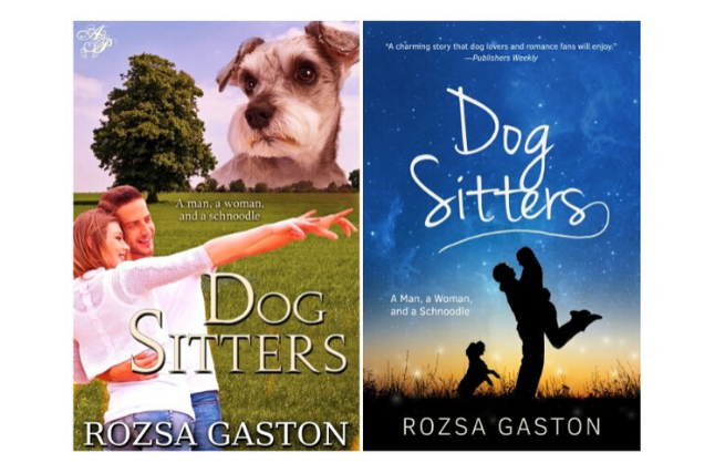
MC: I loved reading about your cover makeover for Dog Sitters. What advice do you have for an author considering updating their covers?
DB: Oooh, thank you! Back in 2017 I was the feature artist for Booklife’s “Cover Redesign” which was printed in the monthly Booklife edition in Publisher’s Weekly magazine. Dog Sitters, by Rozsa Gaston, was my first redesign for them. That was such a fun cover to design.
If you’re an author looking to update your cover through a custom, my best advice is to hire a designer who works in your genre and understands your market. Your money will be best spent with them. Second, do your own market research. Look at the bestselling covers in your genre and subgenres on Amazon, Barnes & Noble, and go to the Big 5 publisher’s websites and look at those covers.
Get a good idea of the market that’s selling right now, and the books on pre-order. This will help you if you decide you want to purchase a pre-made cover instead of a custom. You can make an informed purchasing decision instead of guessing. If you’re thinking of purchasing a pre-made cover, look at what genres that designer specializes or works in. If they work in your genre, their remade covers will be designed to market, making you more confident in your decision.
The Checklist
MC: Any final tips you’d like to share?
DB: Before even searching for a cover designer, or searching for a pre-made cover to purchase, make sure you know these following things about your book:
The genre of your book. This seems simple, yet it’s amazing how many author’s aren’t sure. Most authors may not realize it, but the genre is a very important aspect to a cover design. Even if you’re doing a cross-genre book, it’s important to pick which genre is more dominant in the story, so that the cover can be geared toward the right target audience. Not sure what genre your book is? I'd recommend asking your editor/proofreader because they should be able to direct you to the right genre(s).
Target audience. Narrowing down your target audience will not only help you with the cover design but also with your advertising. Yes, men and women from the ages of 18–100 may enjoy your book, but who is really going to connect with it the most? Usually this can be narrowed down to one gender and an age range of ~20 years. For example, women ages 40–65. If you look at the Harry Potter series, all ages can enjoy it and have enjoyed it, but its primary target audience is middle school-age kids. Not sure who your primary target audience is? Determine what famous authors are the most similar to your plot and look at their target audience. This will give you a better understanding of yours.
Tone and mood. This ties into the genre, but knowing the overall tone of your book is very important. If you describe your book as both light-hearted and dark, well, the designer will not know which aspect is more important to portray on the cover. You also want to make sure your reader knows what to expect when they pick up your book. Is it going to be serious, make you laugh, make you cry, give you nightmares? If you make the cover look happy, but it’s a very serious, heavy story, you will be targeting the wrong audience which can lead to bad reviews.
Emotion. Although this is related to the tone, I feel it deserves its own mention. Readers are drawn to covers that give them an instant emotion, whether it’s love, fear, sadness, curiosity, strength, betrayal, calm, sense of adventure, and the list goes on. If you can capture the right emotion on your book cover, you’ll be quicker to hook a reader. So if you know what emotion you want to capture, then you can share that with your designer and they should know how to implement it.
By having these four aspects narrowed down, you’ll be setting yourself up for a great experience with a cover designer, whether it’s through a custom or pre-made purchase.
Takeaways
Wow, Deborah! Thank you for taking the time to answer my questions so thoroughly.
There are so many things to consider when designing an enticing book cover. The emotion you’re trying to convey as well as meeting genre and reader expectations without overcrowding the cover all come into play. Whether you plan to do it yourself, or hire a professional like Deborah, be sure to take the time necessary to plan your cover. People will judge your book by its cover!

Be confident about grammar
Check every email, essay, or story for grammar mistakes. Fix them before you press send.