
Hey ProWriters! We know that many of you are working on self-publishing your novels—perhaps for the first time. With that in mind, we’ve set out to connect you with the people who can help you through the process, from writing, to editing, to marketing.
Today, we’re focussing on cover design, one of the trickiest things to get right as an indie author. We reached out to Andre Calihanna over at BookBaby, who has kindly shared this interview with artist and book cover designer, Gina Stewart. Keep reading for some brilliant book cover insight. Over to Andre.
For all the obvious reasons, having a professional and compelling book cover is a necessity if you’re bringing a book to market. On a shelf in a brick-and-mortar store, your cover has to compete with hundreds of other titles to call attention to your work. Online, amidst the countless images and calls for a reader’s attention on any given web page, your book cover needs to make its case, sometimes at an impossibly small size.
So how does an independent author go about producing a book cover design worthy of the great content you crafted on the pages within? Typically, by working with a professional graphic artist with experience designing book covers. After all, there are industry expectations, genre expectations, and reader expectations to cater to, and unless you’re an experienced designer, you’re not the person for the job.
With that in mind, I turned to an expert, BookBaby graphic designer Gina Stewart, who has designed over 1,000 book covers for independent authors of every stripe and genre, and asked her advice for authors looking to get a killer design for their book.
- 1. Don’t be too mysterious
- 2. Don’t make the back cover an afterthought
- 3. Don’t attempt to tell the book’s entire story
- 4. Give your designer a starting point
- 5. Provide high-resolution images
- 6. Give your designer plenty of room to be creative
- 7. Embrace collaboration
- 8. Sometimes, a simple solution is the best solution
1. Don’t be too mysterious
Believe it or not, some authors don’t want to include their name on their book cover—some don’t even want the book’s title on the cover.
While including the title and your name isn’t a legal requirement, not including this information actively sabotages your marketing and your chances of building name recognition as an author. There’s also a chance some distributors and retailers won’t accept a book without this information, so this is one place where you should conform to the norms and expectations of the industry and your potential readers.
“Other than that,” says Stewart, “your cover design is all subjective based on how to best promote the content of the book.”
2. Don’t make the back cover an afterthought
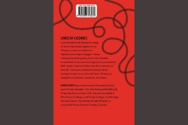
Just like the book title and author’s name are critically important elements for the front cover, a book synopsis and brief author bio are strongly recommended inclusions for the back cover. Keep the writing tight and compelling and make the design clean and easy to read.
“I think authors spend so much time writing their books that, sometimes, they forget how important the back cover can be,” warns Stewart. “I know I make a quick judgement about a book based on the back cover text when I’m considering a new read.”
3. Don’t attempt to tell the book’s entire story
The book cover should certainly reflect the mood of the writing and relate to the substance of the story, but you cannot tell the entire story with your cover design. For staters, a book cover is a relatively small space to work with, so the goal is to create a provocative image or style that conveys something about the story and makes the potential reader curious to know more.
“The best covers are ones that ‘set up’ what the book is about, where the imagery intrigues the reader enough to want to know more. It should be fairly simple, yet striking.”
4. Give your designer a starting point
Providing samples of covers you like—and that will work in your given genre—can give the designer a good idea of your aesthetic and help him or her make choices you’ll be happy with.
“I like it when the author provides a few examples of covers they like, just to know their aesthetic taste,” says Stewart. “Because, hey, designing a cover for someone you’ve never met is like trying to pick out an outfit for them!”
5. Provide high-resolution images
If you have a photograph or image you want to use for your book cover, first, you have to secure the rights to it for your intended use. That means it needs to be your proprietary art or photo, or you need to get the necessary clearances.
Then, you need to provide a high-resolution image or an original that can be scanned at the proper resolution. Typically, that means 300 dpi at full size, but you’ll want to confirm the specifications with your designer. This goes for your author photo, too.
“Nothing screams ‘amateur’ like a blurry or pixelated photo.”
6. Give your designer plenty of room to be creative
This might be the most difficult point to navigate, because this book is your creative work, after all, and you know the story and have the most vivid images of it in your head. But you’re working with a graphic artist for a reason, and that’s because your expertise is in wordsmithing, not visual design.
Convey your ideas, provide direction and examples, and give your designer room to bring his or her own artistic creativity to the project. If there is something specific you want on the cover, make that clear, but having too many “must-haves” can make the design job impossible.
“I like to be given a general idea of what an author might like to see on the cover, but prefer the creative freedom to come up with something on my own. When you let a creative person do what they do best, you’ll likely get a better result.”

7. Embrace collaboration
One of the true benefits of self-publishing a book is the creative control it affords every aspect of the process and production, including the cover design. There are plenty of stories of traditionally published authors being disappointed—if not downright horrified—by the cover a publishing house foisted on their book, a process in which they had zero input.
The trouble with complete creative control is that authors unfamiliar with the design process might lose faith in the designer if the first proof doesn’t perfectly align with their expectations. Cover design can be an iterative process, and changes and revisions are sometimes necessary. In these situations, effectively communicating what you do or do not like about an initial design is key to emerging with the results you want. A knee-jerk reaction of micro-managing a designer will be less likely to work than constructive feedback that sets the artist on the road to delivering a design you love.
“Sometimes, if we don’t create the perfect cover an author was expecting right out of the gate,” Stewart explains, “they get frustrated and can even be a bit surly, which is not helpful to the process. I think it stems from the fact that this could be the first time they’ve ever worked with a graphic artist and don’t realize that the process might require a few attempts before we land on an idea that resonates with them.”
8. Sometimes, a simple solution is the best solution
As with anything, a simple, uncluttered approach may be the best path forward. It can be true for writing, and sometimes, it’s true for design. It’s not easy to accomplish, and if you’ve hired an artist, your inclination may be to expect some sort of intricate, fantastical piece of art with a dozen elements from your story included. Very often, that’s not the direction your project needs, and trusting your designer’s instincts may be more difficult in a minimalist design than an ornate bit of art.
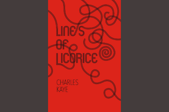
“I love doing striking yet simple designs that pop off the page,” says Stewart. “For example, I really enjoyed working on a poetry book called Lines of Licorice. You would never think this by looking at it, but it was actually a very challenging cover to create. Sometimes the simple ideas are the most difficult to execute.”
Gina Stewart is a painter and graphic designer. In addition to designing books for BookBaby, Gina has designed and illustrated album covers for independent artists and well-known musicians including Paul McCartney, Billy Joel, Glen Phillips, and Peter Tork. When she’s not designing, she paints pictures of animals in fantastical situations.
Should I go with traditional, indie, or hybrid publishing? Download this free book now:
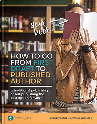
How to Go From First Draft to Published Author
How do I write a pitch? What kind of royalties should I expect? What the heck are beta readers and why do I need them?
This guide will take you through the entire process, from refining your manuscript to choosing a publishing track to releasing your book into the world.

Be confident about grammar
Check every email, essay, or story for grammar mistakes. Fix them before you press send.